
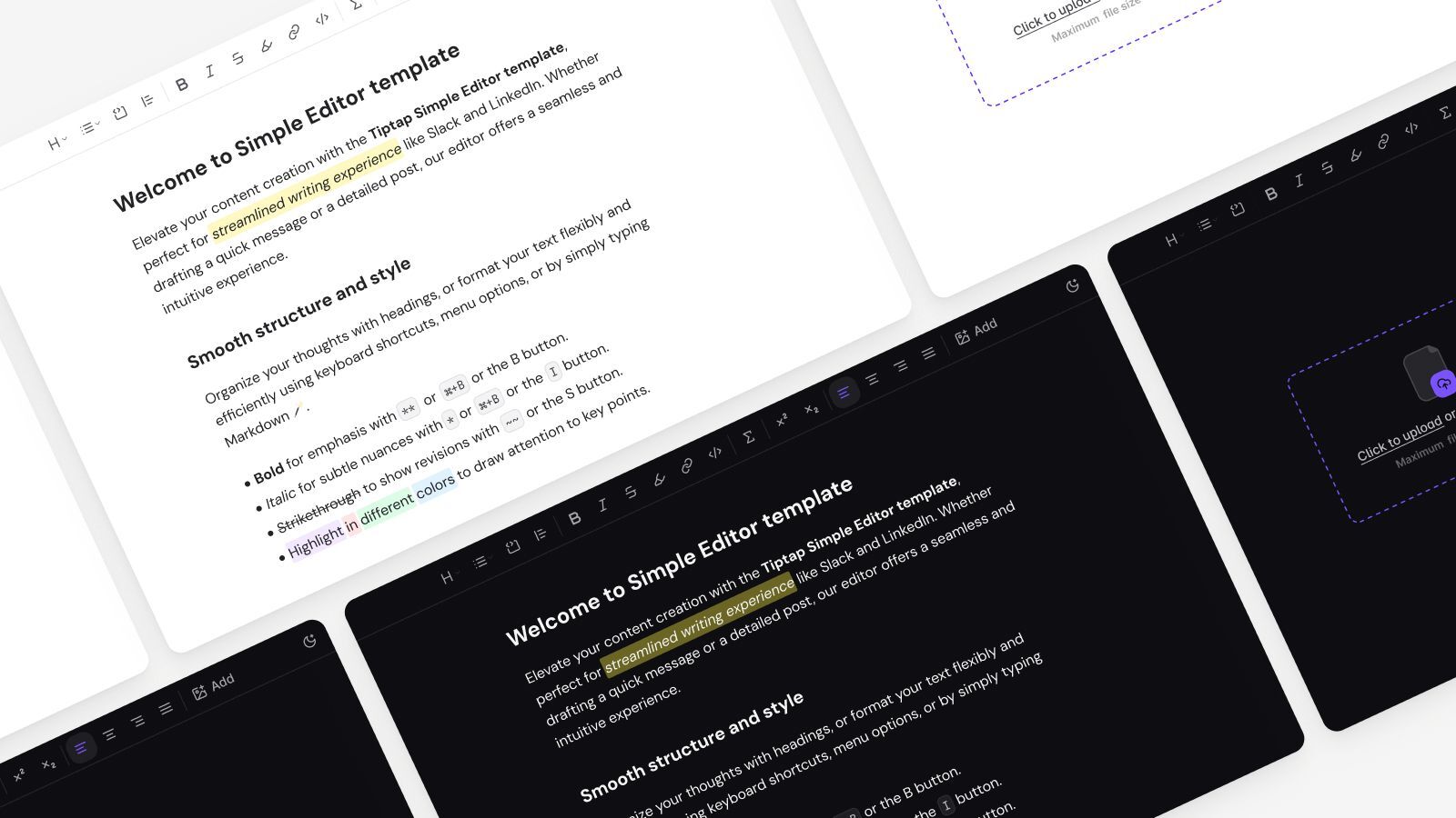
Integrate Tiptap UI Components
Tiptap is headless and modular, giving you full control over the UI. The Tiptap UI Components library provides prebuilt interfaces, so you don’t have to build everything from scratch. Use them as-is or customize them to fit your setup.
React 19 and Framework Compatibility
We’re currently working on upgrading support for React 19 and newer framework versions. Some components may not yet be fully compatible. For now, the UI Components work best with React 18 (and corresponding framework versions like Next.js 15). We’ll update this page once the new versions are fully supported.
Get started
License and source code
Tiptap UI Components follow the same license as the editor extension they’re built on.
- If the extension is open source (like Bold, Heading, or Image), the UI component is MIT licensed too.
- You’re free to read the source code, copy it, and customize it however you like.
Some components are built for paid Tiptap features, like Comments or Version History.
- These components are not open source.
- Most include frontend logic that depends on Tiptap’s backend services.
- A Tiptap Cloud subscription or trial is required to use them.
No matter the type (free or cloud-connected), you can inspect the source code and adapt it to your use case.
Tiptap Cloud Features
We’re starting with open source components. Components for Tiptap Cloud features will roll out gradually.
How components are installed
Tiptap UI Components are not published as an npm package. The CLI copies them into your project as source files you own and can edit:
npx @tiptap/cli@latest add <component>Each component also pulls in the other components, hooks, icons, libs, and styles it depends on — automatically. That is why an installed component's imports (for example @/components/tiptap-node/image-node/image-node-extension) resolve to files in your own codebase rather than a module in node_modules. To get everything a demo on these pages uses, install that component or template with the command above; each component page lists its referenced files under Referenced Components.
Design defaults
Components are designed to feel vanilla and blend into your design. They come with neutral styling: minimal colors, basic spacing, and no strong visual opinions. You can use them as-is or customize them to match your brand.
The design is consistent and cohesive across all components, so if you use multiple of them together, they’ll match nicely without extra work.
- No complex overrides or
!importanthacks needed - Just edit the code directly because it’s meant to be forked or extended
Components and primitives
To build a great editing experience in your Tiptap editor, you can integrate UI elements. The library provides different types of building blocks for this: Components, Node Components and Primitives.
Components
Ready-made, feature-specific React components like a heading dropdown for example. Each UI Component typically pairs with a Tiptap extension (e.g., the ListButton relies on list-related extensions), and uses React hooks to interact with the editor’s state.
- Works with extensions: To use a component (e.g.,
HeadingDropdownMenu), ensure the matching Tiptap extension (like@tiptap/extension-heading) is enabled in your editor. - Leverages hooks: Many components internally consume hooks (like
useTiptapEditororuseFloatingElement) to synchronize with editor state, handle positioning, or manage keyboard navigation. You can also use these hooks in your own custom components. - Easy customization: By default, these components have minimal styling so they can blend into your design. You can fully override or extend them. Each component’s source code is openly available for direct edits with no
!importanthacks.
Primitives
Low-level UI elements like Button, DropdownMenu, Popover and Spacer. They’re the foundation of many UI Components, handling accessibility and basic behavior. You can mix and match these primitives to create your own editor controls or to further customize existing components.